- +506 546-4484
- royconsultants@royconsultants.ca
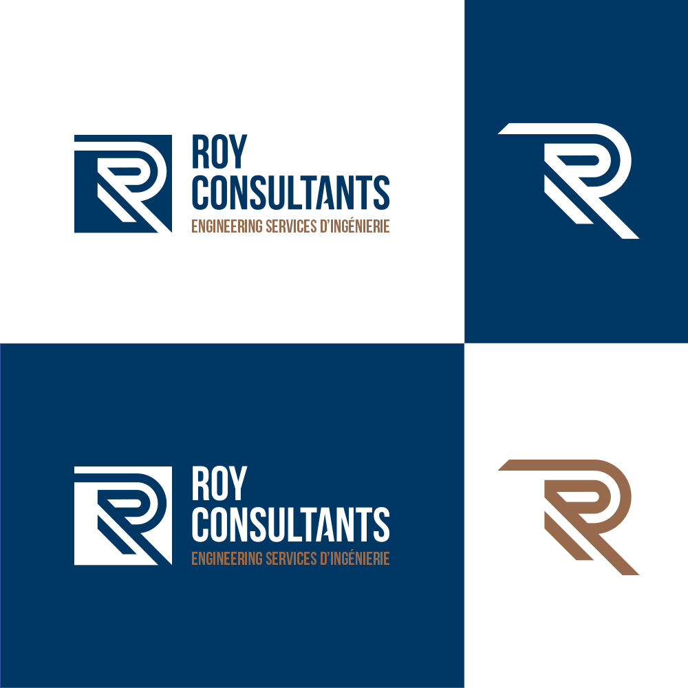
The two Rs of the symbol, the origin of the first logotype designed in 1984, symbolized a coat of arms inspired by heraldry, and reflected "a look toward the future, whilst remembering where one came from".
Now, the two Rs are united and look forward. The symbol’s graphic treatment is intended to be simple to accentuate its memorization. The parallel lines refer to the collaborative approach that aims to support the client, with stakeholders, in carrying out the multidisciplinary engineering projects.
The parallel lines also refer to the layouts of the roads that unite the communities, both rural and urban, with which Roy Consultants works.
The typography of the symbol is upright and gives the image a more modern feel. The blue and bronze colours are reminiscent of those adorn by the old company logo.
